Payroll Executive Overview (YoY)
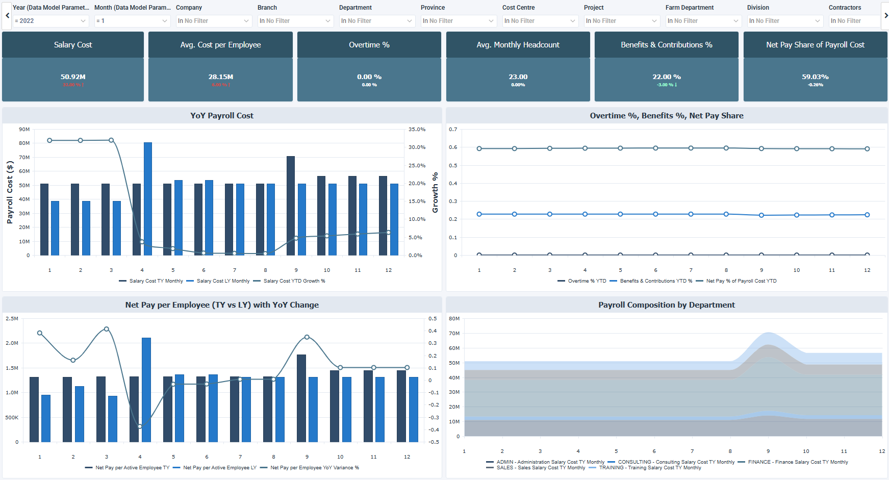
The Payroll Executive Overview (YoY) dashboard for Sage 300 People looks at payroll cost structure, workforce efficiency, benefit costs, and net pay distribution across the organization. It includes year over year (YoY) payroll trends, cost per employee, the share of payroll that goes to benefits, and payroll composition by department.
How to use the payroll executive overview dashboard
- Follow the salary cost of each month this year against the same month last year.
- Check the cost per employee and the net pay per employee against last year.
- Read the benefits and contributions percentage next to the overtime percentage and the net pay share of payroll cost.
- Set the average monthly headcount against the growth of payroll cost.
- See how salary cost divides across departments month by month.
Filters
Use the filtering panel at the top of the Workforce Demographics dashboard to control which data is shown. The filters apply to all views and ensure the dashboard reflects the selections you choose.
The filters from Branch to TWK Costing work as a hierarchy: a selection in one limits the values listed in the filters that come after it.
The list below may not match what you see in your own filters. Sage lets each company name and order these hierarchy filters on its own, so Branch through TWK Costing is only one possible example.
Key performance indicators (KPIs)
The key performance indicators (KPIs) at the top of the dashboard show six payroll measures for the selected fiscal year to date, and update based on the filters you apply.
| KPI | What it measures |
|---|---|
| Salary Cost | Total gross salary expenditure for the selected fiscal year to date, so a higher value means payroll costs more. |
| Avg. Cost per Employee | Average salary cost per active employee, where a higher value may come from higher pay or a more senior workforce. |
| Overtime % | Overtime cost as a proportion of total payroll cost, where a higher value means more reliance on overtime and may point to a capacity strain. |
| Avg. Monthly Headcount | Average number of active employees per month for the selected period, which increases as the workforce expands. |
| Benefits & Contributions % | Employer benefit and statutory contribution costs as a percentage of total payroll, so a higher value means benefits and contributions take a larger share of payroll. |
| Net Pay Share of Payroll Cost | Proportion of total payroll cost paid as net pay, where a higher value means a larger share of payroll goes directly to employees. |
Visual components
| View name | Type of view | What it shows |
|---|---|---|
| YoY Payroll Cost | Combination | Compares the salary cost of each month this year (TY) with the same month last year (LY), with the salary cost year to date growth % as a line. |
| Overtime %, Benefits %, Net Pay Share | Spline | Follows the year to date overtime %, the benefits and contributions %, and the net pay share of payroll cost for each month of the year. |
| Net Pay per Employee with YoY Change | Combination | Displays the net pay per active employee for each month this year and last year, with the year over year variance % as a line. |
| Payroll Composition by Department | Stacked Area | Breaks down the monthly salary cost by department, such as administration, consulting, finance, sales, and training. |