Workforce Demographics
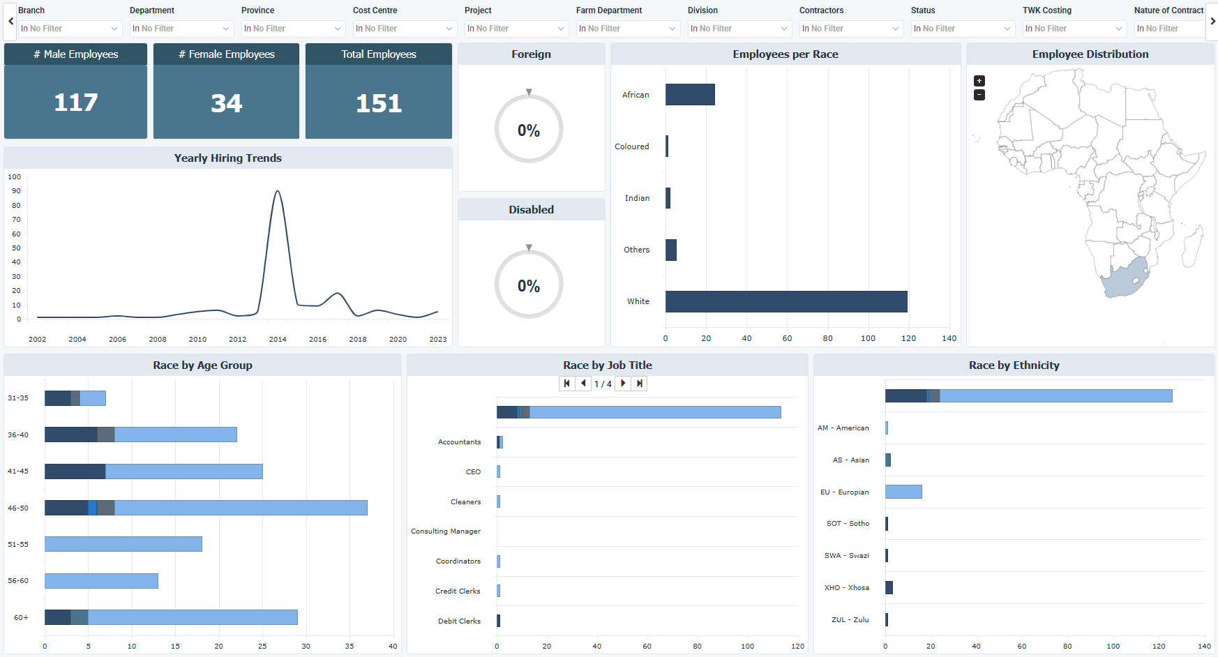
The Workforce Demographics dashboard for Sage 300 People describes workforce composition, diversity distribution, hiring evolution, and demographic segmentation across the organization. It includes workforce structure, inclusion metrics, geographic distribution, and long term hiring trends.
How to use the workforce demographics dashboard
- Review workforce composition through gender and demographic balance, including diversity and equity.
- Check regulatory compliance metrics such as disability and foreign worker representation, for statutory reporting and audits.
- Analyze long term hiring trends across the historical hiring cycles to forecast workforce growth and capacity.
- Find concentration risks and representation gaps across demographic segments.
- See employee distribution by country and compare regions.
Filters
Use the filtering panel at the top of the Workforce Demographics dashboard to control which data is shown. The filters apply to all views and ensure the dashboard reflects the selections you choose.
The filters from Branch to Nature of Contract work as a hierarchy: a selection in one limits the values listed in the filters that come after it.
The list below may not match what you see in your own filters. Sage lets each company name and order these hierarchy filters on its own, so Branch through Nature of Contract is only one possible example.
Key performance indicators (KPIs)
The key performance indicators (KPIs) at the top of the dashboard show three employee count measures, and update based on the filters you apply.
| KPI | What it measures |
|---|---|
| Male Employees | Total number of active male employees. Higher values mean men make up a larger part of the workforce, and lower values mean other demographic groups make up a larger part. |
| Female Employees | Total number of active female employees. Higher values mean women make up a larger part of the workforce, and lower values mean a smaller part, which may point to a gender imbalance. |
| Total Employees | Total number of active employees. Higher values mean the workforce grew, and lower values mean it shrank or was restructured. |
Visual components
| View name | Type of view | What it shows |
|---|---|---|
| Foreign Employees | Simple Gauge | Measures the percentage of employees classified as foreign nationals. Higher values mean more of the workforce comes from abroad, and lower values mean a mostly domestic workforce. |
| Disabled Employees | Simple Gauge | Reports the percentage of employees registered with a disability status. Higher values mean more employees are registered, and lower values mean fewer, which may point to reduced accessibility or disclosure. |
| Yearly Hiring Trends | Spline | Follows the number of employees hired each year to show peaks and drops in hiring over time. |
| Employees per Race | Horizontal Bar | Compares the number of employees by race. |
| Employee Distribution | Map | Displays employees by country on a map of Africa, with shading on the countries where employees are located. |
| Race by Age Group | Stacked Bar | Splits the number of employees in each age group by race, with age groups in five year ranges. |
| Race by Job Title | Stacked Bar | Breaks down the number of employees in each job title by race, with arrows to move between pages of job titles. |
| Race by Ethnicity | Stacked Bar | Groups the employees of each ethnicity by race. |