Strategic Financial Health & Efficiency
The Strategic Financial Health & Efficiency dashboard for Sage 100 North America combines capital efficiency, profitability, and financial structure metrics to give a broad view of the company's financial position. It covers how effectively capital and assets generate returns, how much of revenue goes to capital expenditures, and how the balance between equity and debt evolves over time. Use this dashboard to assess long term financial sustainability and monitor how efficiency metrics trend month by month.
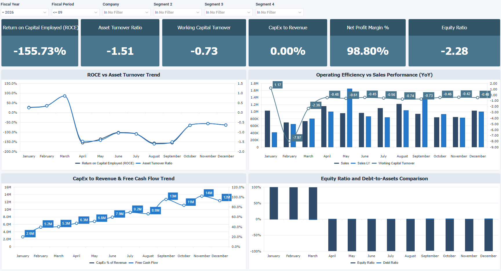
It pairs each KPI with a matching chart that shows how the metric moves over time. The top row of charts focuses on capital and operating efficiency, comparing ROCE against asset turnover and sales performance against working capital turnover (with a year over year comparison). The bottom row shifts to financial structure, tracking CapEx relative to revenue and free cash flow on the left, and the split between equity and debt on the right.
How to use the strategic financial health and efficiency dashboard
- Assess capital efficiency using ROCE and asset turnover to understand how well capital and assets are generating returns.
- Compare sales performance year over year against working capital turnover to see if growth is backed by efficient capital use.
- Monitor CapEx relative to revenue to track reinvestment, and check free cash flow to see what remains after investment.
- Review the equity and debt balance over time to understand how the financial structure is shifting.
Filters
Use the filtering panel at the top of the Strategic Financial Health & Efficiency dashboard to control which data is shown. The filters apply to all views and ensure the dashboard reflects the selections you choose.
Key performance indicators (KPIs)
The key performance indicators (KPIs) are displayed at the top of the dashboard. They show capital efficiency, profitability, and financial structure metrics, and update based on the filters you apply.
| KPI | What it measures |
|---|---|
| Return on Capital Employed (ROCE) | Earnings relative to total capital employed, showing how efficiently all invested capital generates profit. |
| Asset Turnover Ratio | Revenue relative to total assets, indicating how effectively assets generate sales. |
| Working Capital Turnover | Revenue divided by working capital, showing how efficiently working capital supports revenue. |
| CapEx to Revenue | Capital expenditures as a percentage of revenue, reflecting how much of revenue is reinvested into the business. |
| Net Profit Margin % | Net income as a percentage of revenue, showing what portion of each dollar earned becomes profit. |
| Equity Ratio | Total equity divided by total assets, indicating how much of the business is funded by equity vs. debt. |
Visual components
| View name | Type of view | What it shows |
|---|---|---|
| ROCE vs Asset Turnover Trend | Combination | Plots ROCE and asset turnover ratio month by month to show how capital efficiency and asset productivity trend together over time. |
| Operating Efficiency vs Sales Performance | Combination | Plots sales (this year and last year) alongside working capital turnover month by month to compare sales growth against capital efficiency. |
| CapEx to Revenue & Free Cash Flow Trend | Combination | Plots CapEx as a percentage of revenue alongside free cash flow month by month to show how investment levels relate to available cash. |
| Equity Ratio and Debt to Assets Comparison | Stacked Bar | Shows the equity ratio and debt ratio stacked by month, making the split between equity and debt funding visible over time. |